
Welcome! Our Economics lessons Continues! Do have a great moment studying with us!
Lesson Note
Subject: Economics
Topic: Basic Tools For Economic Analysis
Lesson Objectives: by the end of the lesson the learners should be able to;
1. Describe the terms Table, graph, pie chart, bar chart, histogram, pictogram.
2. State the characteristics of the above stated terms;
3. State the functions of each tools as used for analysis of economic problems.
Basic Tools For Economic Analysis
Introduction
Some basic tools are required for proper analysis of economic problems. Most of these problems are often presented in statements which may be too difficult to understand. The use of these basic tools therefore makes it easier for better interpretation and understanding of economic analysis include: table, graphs, charts, mode, median, mean, standard deviation, etc.
1.Tables
A table is defined as a systematic and orderly arrangement of information, facts or data using rows and columns for presentation, which makes it easier for better understanding. Tables serve as the most commonly used tools for economic analysis.For example, the table below shows the number of vehicles demanded in a country.

Interpretation Of The TableFrom the table above, it can be seen that the number of vehicles demanded at a given price varies. When the price was (#50,000.00), more of the vehicles were in high demand (800 vehicles) but when the price was high (#1,000,000.00), only few of the vehicles (60 vehicles) were demanded.
Characteristics of a table
- A table must be very simple.
- A table must be easy to understand.
- A table must be numbered properly if they are many.
- It must have a title or heading.
- The unit of measurement used in the table must be clearly stated.
- The source of information must should be stated if known.
- The purpose of creating a table must be known.
- The sub-headings for the columns and rows used must be stated.
Importance of Tables
Tables are very important in various ways.
- Ease of representation: A large amount of data can be easily confined in a data table. Evidently, it is the simplest form of data presentation. In order words, tables help to summarise the data presented.
- Ease of analysis: Data tables are frequently used for statistical analysis like calculation of central tendency, dispersion etc.
- Helps in comparison: In a data table, the rows and columns which are required to be compared can be placed next to each other. To point out, this facilitates comparison as it becomes easy to compare each value.
- Economical: Construction of a data table is fairly easy and presents the data in a manner which is really easy on the eyes of a reader. Moreover, it saves time as well as space.
- The use of table makes it easier and faster to make decision.
- With the use of a table, data are better understood.
2.Graphs
Graphs may be defined as a diagram showing a functional relationship between two variables. Graph is one of the basic tools used by economists for economic analysis. Information presented on tables can be translated into graph for better understanding. Examples are line graphs, pie graphs (charts), bar graphs, pictographs (pictograms).
Features of Graphs
- All graphs must have title.
- Graphs must possess appropriate scales.
- All graphs should have X-axis on the horizontal side and Y-axis on the vertical side.
- Graphs must be labelled properly for better understanding.
- Graphs must show the source of the data presented.
- The unit of measurement must be indicated min a good graph.
- The X and Y axes of the graph must carry different variables.
Importance of Graphs
- Graphs help to show relationship between two variables.
- Graphs make clearer and quicker impression about quantitative information illustrated in tabular form.
- Graphs also help provide basis for comparing variables provided in the table.
- Graphs make it possible for changes in variables on quantities to be expressed.
- Values or quantities provided in the table are better understood and appreciated either in graphs or diagrams.
3. Line Graph
Line graph as the name implies, is a line used for data where emphasis is on continuous change. In other words, line graph is used to join or connect the highest and the lowest points of a group of data. Line graph could be straight or curve.For example, the table below shows the production of cocoa from 1980 to 1990.

The table above can be represented in a straight line graph just like the one below.

4. Pie Chart
A pie chart or graph is a simple circle of any convenient size which is divided into sections or sectors, each of which is proportional to the quantity or value it represents.The pie chart is usually measured either in percentage or in degrees with the aid of a mathematical device called a protractor. The entire circle is represented by 360 degrees with the aid of a protractor.
Procedures for constructing pie chart
- Add up the total figure of the product or value under consideration.
- Work out the percentage or degree of the total which each component part represents.
- Draw a circle of a convenient size.
- Divide the circle up into sectors substended by these angles calculated in step two above using a protractor.
- Write the percentage or degree of each sector by it.
- Use key where the information can not be written inside the circle to show what each sector represents.
For example, the table below can be represented in a pie chart.
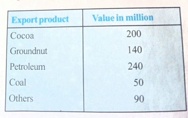
For us to represent this information in a pie chart, we must first do some calculations in degrees.SolutionStep 1: Add up the total value of all the products, that is,
200+140+240+50+90 = 720
Step 2: Arrange your workings or calculations as shown in the table below

Step 3: Using the values in degrees, now draw your pie chart using a protractor just like the one below:

With this, you are done with piechart.
5. Bar Charts (Graphs)
Bar chart or graph is a graph made up of bars of rectangles which are of equal width and whose lengths are proportional to the quantities they represent. The major characteristics of the bar chart is that the body of the bars must not touch each other. There must be a space or gap between one bar and another. Bar chart may be arranged vertically or horizontally.
Types of Bar Charts
There are three major types of bar charts. These are simple bar chart, component bar chart, and multiple bar chart.a. Simple Bar Chart: simple bar chart is used when the data given are made up of only one item or component. The bar chart can be presented by tabulated data with evenly spaced bars, separated by gaps with the length proportional to the magnitude of the value given.b. Component Bar Chart: A component bar chart is used when the data involved are of two variables.c. Multiple Bar Chart: multiple bar chart is used when there are about three or more variables in a given data. It has multiple bars, each of which stands for a component variable.For example, the information in the table below can be represented in a bar chart.

SolutionStep 1. Since the figures given are quite large, we can choose to reduce them by using the scale: 1cm: 1000 tonnes. That is, divide each figure by 1000 to be reduced. Note, this is optional.Step 2: Draw a table and arrange the new figures after reduction just like the table below:

Step 3: Draw your bar chat just like the one below:

6. Pictograms
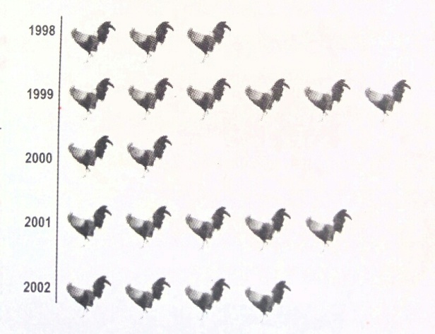
Pictograms or pictographs are charts in which pictures or drawings of objects are used to represent the magnitude of the variables or to convey other information. In this case, pictures or diagrams are more appreciated rather than tables or other charts.For example, the information contained in the table below can be represented using pictogram.
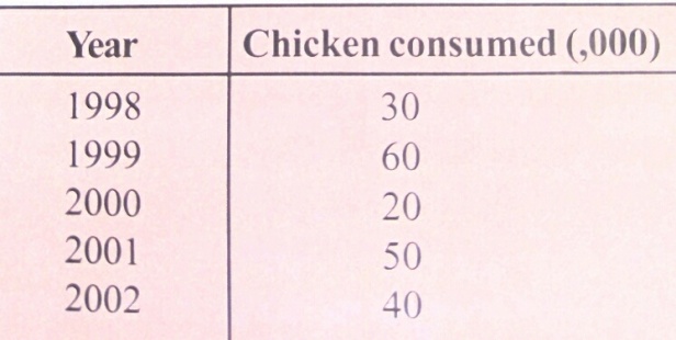
SolutionStep 1. Draw a vertical line and arrange the year.Step 2: Note that one picture is to represent 10,000 chickens.Step 3: Draw the picture of the chickens besides each year as shown in the vertical line. See example below:
7. Histograms
Histogram is as graphical representation of frequency distribution. It is made up of a set of rectangles that have their bases on the horizontal axis, i.e X-axis, Y-axis. They also have their rectangles at the centres on the class mark (I.e. mid point) of each interval. The height of each rectangle represents the magnitude of the data lying within each Cass interval. The areas of the rectangles are proportional to the class frequencies. In drawing a histogram, there is no gap or space between two bars, unlike the bar chart.
For example the below shows the number of tubers of yam harvested in certain number of days.

This information can be represented using histogram.
Solution: No much is required. Just draw your vertical and horizontal lines, then join every bar in continuation of the other. check the below:

Done studying? See previous lessons in Economics
1. Write short note on the following
a. Table
b. graph
c. pie chart
d. bar chart
e. histogram
f. pictogram
2. State the importance of the above listed economic tools as used for analysing economic problems.
3. What are the characteristics of tables and graphs?
Questions answered correctly? Kudos!!
Do stay connected to itsmyschoollibrary.com for more educational contents.